Dec 04, 2025 | 764 words | 8 min read
3.1.1. Materials#
Descriptive Statistics#
Descriptive statistics describe data using measures of central tendencies and measures of variability (how spread out the data is). These allow us to make evidence-based decisions.
Basic Descriptors#
Function |
Description |
MS Excel Formula |
|---|---|---|
Count |
The total number of data points in the set. |
|
Minimum |
The smallest value in the data set. |
|
Maximum |
The largest value in the data set. |
|
Measures of Central Tendency#
Function |
Description |
MS Excel Formula |
|---|---|---|
Mean |
Sum of all the data points divided by the total number of data points. |
|
Median |
Middle number of the data set when data is listed from smallest to largest. |
|
Mode |
Most frequently occurring number. |
|
If you expect one mode |
|
|
If you expect multiple modes |
|
Note
The mean is sensitive to outliers. An outlier is a data point that is far away from the rest of the data.
Measures of Variability#
Function |
Description |
MS Excel Formula |
|---|---|---|
Range |
Difference between the maximum and minimum values. |
|
Variance |
Average of the squared difference of each data point from the mean. Is equal to the standard deviation squared. |
|
Standard Deviation |
A measure of the amount of variation in a data set. Is equal to the square root of the variance. |
|
Note
A low standard deviation suggests that the data points are close to the mean while a high standard deviation suggests that the data points are more spread out.
Key Equations#
Average
Variance of a Sample
Standard Deviation of a Sample
where, \(n\) is the total number of data points, \(x_i\) represents each individual data point, \(\overline{x}\) is the average (mean) value of the sample, \(\sigma^2\) represents the variance of the sample, and \(\sigma\) represents the standard deviation of the sample.
Note
A population is defined as the entire group that you want to draw conclusions about. A sample is a subset of a population. Equations for the variance (\(\sigma^2\)) and standard deviation (\(\sigma\)) of a population are slightly different than those for a sample. When calculating these statistics for a population, we divide by \(n\) (the total number of data points) instead of \(n-1\).
where, \(\mu\) is the average (mean) value of the population.
Distributions#
Histograms#
Histograms can be used to visualize the distribution of a dataset. We will use the Data Analysis ToolPak in MS Excel to create histograms.
Installing the Data Analysis ToolPak#
Follow the steps below to install the Data Analysis ToolPak as an Add-in on your system.
From the File menu select Options (bottom left).
In the Options window, select Add-ins and then click on Go.
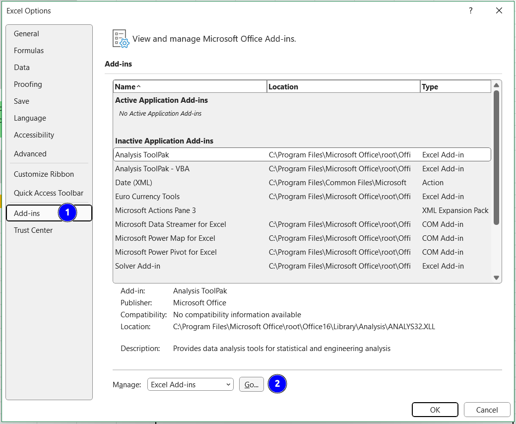
Fig. 3.1 The MS Excel options menu.#
In the Add-ins menu, select Analysis ToolPak and then click OK.
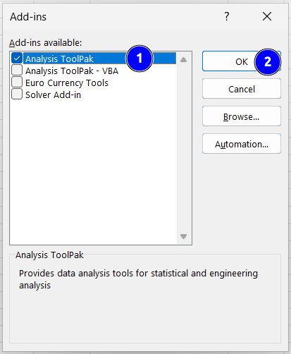
Fig. 3.2 The MS Excel Add-ins menu.#
Now you can find the Analysis ToolPak under the Data tab in the Analysis section of the ribbon.

Fig. 3.3 The MS Excel ribbon with Analysis ToolPak installed.#
From the Tools menu select Excel Add-ins.
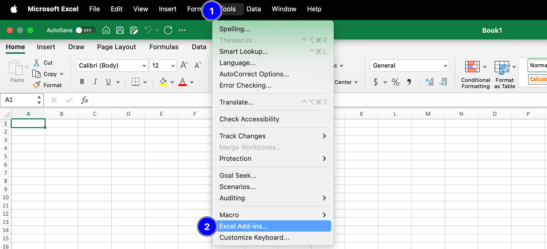
Fig. 3.4 The MS Excel options menu.#
In the Add-ins window, check the box next to Analysis ToolPak and then click on OK.
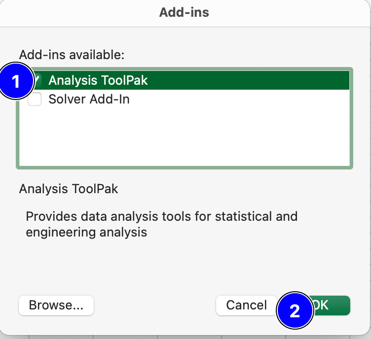
Fig. 3.5 The MS Excel Add-ins menu.#
Now you can launch the Analysis ToolPak by navigating to the Data tab and clicking on Data Analysis.

Fig. 3.6 The MS Excel ribbon with Analysis ToolPak installed.#
Creating a histogram using the Data Analysis ToolPak#
The example worksheet used in the above video can be found in
HistogramExample_Landfillwaste.xlsx.
A work through for making histograms with and without the Data Analysis ToolPak is
provided in
Excel_HistogramExample_FabricIgnition.xlsx.
Note
If a histogram displays continuous data, there should be no gap between your bins.
Skewness#
Skewness is a measure of a dataset’s symmetry (or lack of symmetry). MS Excel function is SKEW()
A perfectly symmetrical data set will have a skewness of 0 and is often known as a normal distribution. A skew less than zero (negative) has a long tail to the left. A skew greater than zero (positive) has a long tail to the right.
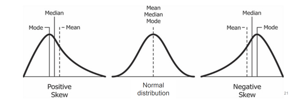
Fig. 3.7 Relationship between mean, median, mode with the skewness.#
Note
Please note that the relationship between mean and median only serves as a guide for the
skewness. If possible, you should always compute the skewness itself instead of relying
on the relationship between mean and median. The skewness can be computed in
MS Excel via the SKEW() function (which computes the adjusted
Fisher-Pearson standardized moment coefficient). Read more about this
here.
Kurtosis#
Kurtosis is a measure of the peakedness and flatness of a distribution.
MS Excel function is KURT().
Distributions with negative kurtosis exhibit tail data exceeding the tails of normal distribution. Distributions with positive kurtosis exhibit tail data that is generally less extreme than the tails of the normal distribution.
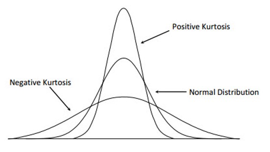
Fig. 3.8 Kurtosis Distribution.#
Note
Skewness differentiates extreme values in one versus the other tail, kurtosis measures extreme values in either tail.
Flowcharts#
Flowcharts are a visual representation of a process or algorithm, showing the steps as boxes of various kinds, and their order by connecting these boxes with arrows.
Click here to watch a video on how to create a basic flowchart in Miro.